By Daniel at LV Carpentry & Tradesmen
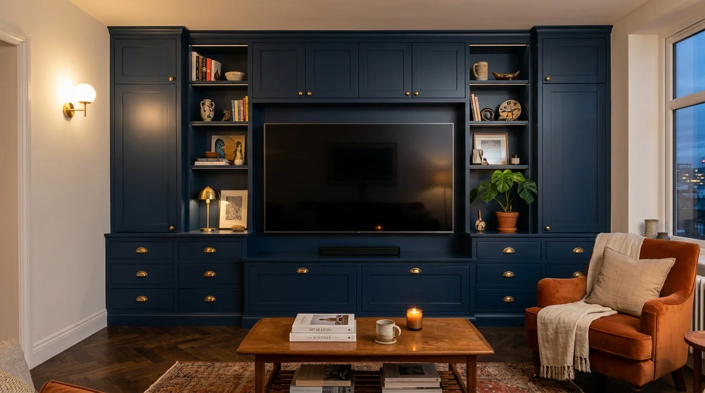
Last month we went back to repaint a media wall we built two years ago. Nothing wrong with the build. The client, James, had chosen a fashionable grey from a photo on his phone, and he'd been quietly unhappy with it for most of those two years. His room faces north. The grey that looked warm and expensive in the photo went cold and flat in his light by lunchtime, every day, forever.
We resprayed it in a deep bronze-green and it is a different room. Same joinery, same lighting, same telly. The colour was the whole problem, and the fix cost him a fraction of the build price but two years of mild irritation. So this is the post I now send people before we talk colours: what we actually paint media walls, which pairings keep working, and the two questions that decide everything before a colour chart comes out.
The two questions that decide your media wall colour
First: which way does the room face? North light is cool and steady, and it drains warmth out of greys and pale blues. South light is warm and forgiving, and almost anything works in it. East and west rooms change through the day, so the colour needs to hold up in both morning and evening. This is not decorator folklore. It is the difference between James's grey and James's green.
Second: do you want the wall to blend or contrast? A media wall painted the same colour as the room reads as architecture, quiet and built-in. A media wall in a contrasting colour reads as furniture, a deliberate object. Both are right in different homes. What rarely works is the accidental middle: a unit slightly darker than the walls in a colour that almost matches. Decide which of the two you are doing, then commit.
Nine media wall colour pairings we regularly specify
These are combinations we have built and been back to see afterwards, which is the only test that counts.
- Natural oak with off-white plaster. The combination we specify most often. Oak brings warmth and visible grain, while a chalky off-white plaster centre keeps the wall light and architectural. It works particularly well in living rooms where the media wall needs to sit comfortably with an existing neutral scheme.
- Walnut veneer with cream plaster. Walnut gives a richer, darker finish without relying on black paint. A warm cream plaster panel lifts the centre of the wall and picks up the golden notes in the veneer. This is a dependable pairing for rooms with warm flooring, brass details or softer evening light.
- Maple with light grey. Maple has a pale, even grain that suits cleaner contemporary interiors. A soft light grey beside it adds definition without making the wall feel heavy. The grey must have a warm undertone, especially in a north-facing room, or it can turn flat and blue.
- Edward Bulmer Tea Green with oak. Tea Green is a muted grey-green with enough depth to frame the screen while still feeling calm. We pair it with natural or lightly limed oak so the scheme stays warm. As with every green, sample it in the room because the balance between grey and green changes with the daylight.
- Warm off-white with walnut. An off-white painted wall with walnut shelves or a walnut floating cabinet is a straightforward way to introduce contrast without darkening the whole room. The timber gives the design a focal point and the pale background keeps it flexible if the furniture changes later.
- Smoked oak with warm grey plaster. Smoked oak has more depth than natural oak but still shows real grain. A warm grey plaster panel keeps the palette tonal and lets the television recede. This works best when the room already contains black metal, darker flooring or charcoal upholstery.
- Natural oak with soft sage. A soft sage painted finish gives more character than a neutral without becoming the loudest colour in the room. Natural oak shelves and cupboard fronts stop the green feeling cool. This pairing suits both simple contemporary joinery and more traditional Shaker detailing.
- Walnut with taupe. Taupe sits between grey and brown, so it connects naturally with walnut veneer. It is useful when cream feels too pale and charcoal feels too severe. Keep the taupe matt and the walnut grain visible so the two surfaces do not merge into one flat block.
- Maple with chalky off-white. For a small room, maple and chalky off-white keep the overall scheme light while still giving the joinery enough material contrast to read as bespoke. We use warm white LEDs with it, because a cool light source can make both finishes look washed out.
How we find colour combinations that work
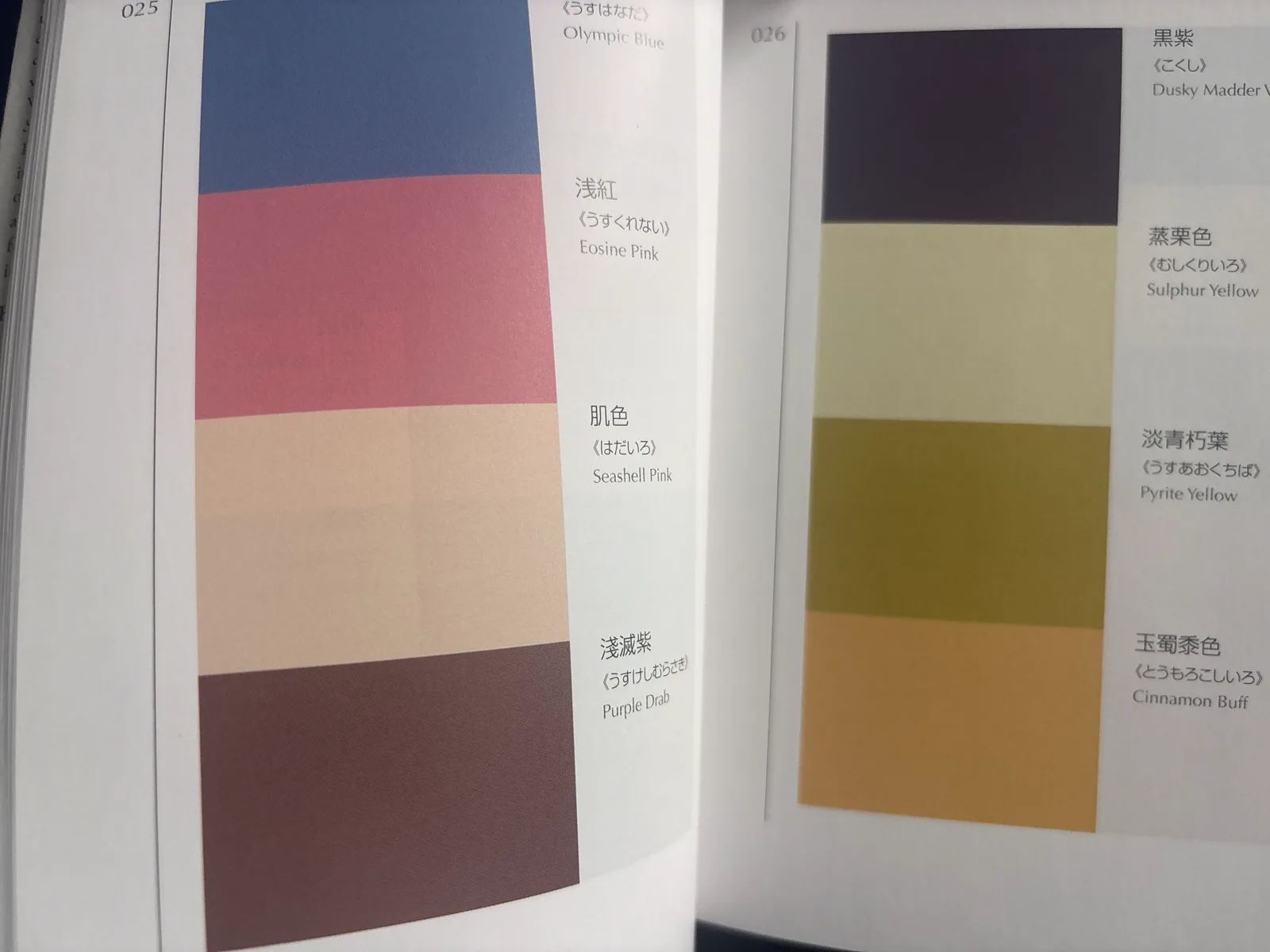
When a client wants to move beyond a familiar timber-and-neutral scheme, one of the references we use is A Dictionary of Color Combinations, a Japanese collection of colour palettes based on work by artist and teacher Sanzo Wada. Instead of choosing one colour in isolation, we start with a complete combination and look at how its light, mid and dark tones could translate into plaster, timber, paint, upholstery and metal details.
The book is a starting point, not a formula. We narrow the palette to the materials that suit the room, then test real samples in its daylight and evening lighting. That keeps the combination interesting while making sure it still works as part of the home. Our Venetian plaster media wall guide shows how we blend, dry and compare several physical colour samples before a client approves the final mixture.

Sheen is the decision nobody makes on purpose
Two walls in the same colour can look completely different because of sheen. Full matt is the current fashion and it photographs beautifully, but it marks, and on the cabinet doors around a family TV it will be touched daily. High sheen shows every ripple in the substrate under lamplight. For most homes we spray a low-sheen joinery lacquer: matt enough to look current, hard enough to wipe.
The other half of this is what the paint sits on. Wall emulsion on MDF joinery never fully hardens and marks if you look at it firmly. A media wall should be sprayed with a proper joinery system in a workshop: primer, two coats, sanded between. This is one of the questions worth asking any company quoting you, alongside the others in our guide to choosing a media wall company.
How we choose colour with clients now
After the grey wall episode, we changed our process. We no longer agree a colour from a chart or a phone photo. We paint A3 boards in the two or three shortlisted colours and leave them with the client for a week, propped against the actual wall. Look at them at breakfast, look at them at 9pm with the lamps on, look at them on a grey Tuesday. The colour that survives all three is the colour.
It costs us a set of sample boards and it has ended colour regret on our builds almost entirely. If you are planning a media wall anywhere across Surrey, Hertfordshire, Buckinghamshire or London, book a consultation and the sample boards are part of it.
Common questions
The scheme we specify most often is a warm natural timber paired with a quiet neutral. Natural oak with off-white plaster is the most common version, followed by walnut veneer with cream plaster and maple with a soft light grey. These combinations feel warm without dominating the room, and the variation in the timber gives the wall depth. A muted green such as Edward Bulmer Tea Green also works well with oak when the room needs more colour.
Darker, in most rooms. A media wall has a large black screen at its centre, and a darker background absorbs the screen visually instead of framing it like a hole in the wall. The exception is a small or north-facing room where a very dark wall can close the space down. There the better move is colour drenching: paint the media wall and the surrounding walls the same mid-depth colour so the joinery reads as architecture rather than a dark object.
A sprayed joinery lacquer in a matt or low-sheen eggshell, not standard wall emulsion. Emulsion on joinery marks quickly, cannot be scrubbed, and never fully hardens on MDF. A two-pack or hardened lacquer sprayed in a workshop gives an even film that takes fingerprints, remote controls and children. Sheen matters too: full matt hides surface imperfections but marks more visibly, so low sheen is the practical middle for family rooms.
Less than people fear, and sometimes the opposite. A dark wall recedes: painted floor to ceiling in one deep colour, the wall reads further away, not closer. What genuinely shrinks a room is contrast clutter, a dark unit stopping short of the ceiling with light wall showing above it. If the room is small, take the colour to the ceiling and keep it consistent. Our small media wall ideas guide covers this in more depth.
Yes, if it was built with a paint-grade finish. A sprayed MDF media wall can be reprepared and resprayed or hand-painted in a new colour for a fraction of the build cost, which is a genuine argument for painted finishes over timber veneer if you change schemes often. Timber and plaster finishes are permanent decisions. We tell clients honestly: choose paint if you redecorate every few years, choose timber if you want the material itself to be the point.